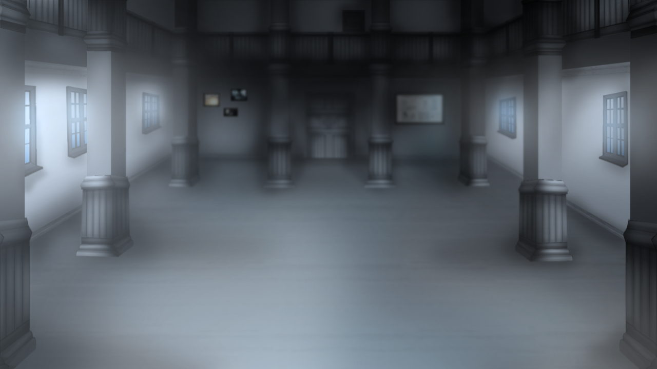
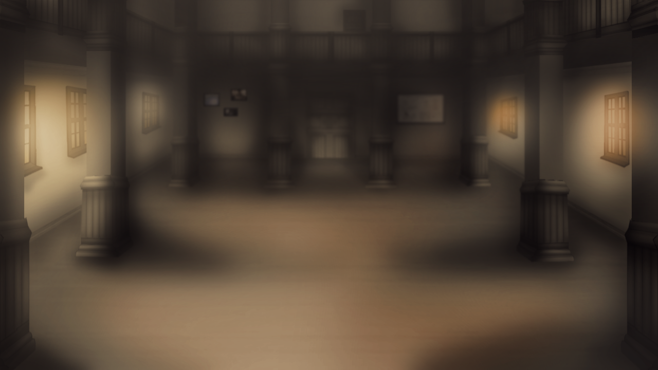
Central hall backgound redrawn and minor update
As I announced in my previous update, I've redrawn the central hall backgrounds from scratch.
 |  |
 |  |
These backgrounds always felt too small - they never felt quite "right" to me, given how this is the biggest open space in the whole building. I'm still not 100% satisfied with them, but I think this is a huge improvement, either way. The feedback I got on the discord server yesterday was very positive, so I'm confident that this change was worth two days of work.
To anyone wondering why I blur my backgrounds this much:
- It's to simulate a sort of depth of field effect where the character sprites look closer, clearer and more focused - I think it helps to focus the player's attention on the speaking characters instead of what's behind them,
- Sometimes it helps smooten out some things that look a little janky, I admit - this was especially the case with the older backgrounds I'm trying to replace,
There's also another minor update now.
What's new in this build?
- Vastly improved central hall backgrounds (you can even see the map of the hospital on the wall now),
- You can now view your notes about patients in the Characters Info screen at any time! That means the notes are finally fulfilling their true purpose - whenever you don't know what to pick during a session, you can pause to look through what you've already learned. The notes are a tool you can use however you want, but I think they should come in handy, especially during the later bits of the game (there is one crucial choice on one of the routes around the middle of the game which depends solely on you remembering a briefly mentioned fact - the notes could save you then),
- Improved the notify screen (the one that shows up at the top of the screen when you take screenshots or use a quick save) - notifications about updating the characters info screen now show up there instead of in the regular dialogue box, and the screen itself looks a lot more like the rest of the game now and not like the default notification,
I'm still focusing on improving the game graphically, and that means backgrounds, UI and sprites are all getting fixed. I've also made some improvements in the later parts of the game, around the middle, but I can't show them yet. I hope to have some new progress I can show you guys soon, though.
Files
Get Absolution: Way of the lost (DEMO)
Absolution: Way of the lost (DEMO)
A horror VN set in a mental hospital
| Status | Canceled |
| Author | Navypink |
| Genre | Visual Novel |
| Tags | 2D, Dark, Horror, Mental Health, Multiple Endings, Otome, Psychological Horror, Ren'Py, Story Rich, yandere |
| Languages | English |
| Accessibility | Subtitles |
More posts
- Full OST on YouTubeDec 07, 2023
- Build B tomorrow + SURVEYJan 19, 2022
- Build A releaseDec 20, 2021
- Bug fixing patchDec 06, 2021
- Final demo buildDec 05, 2021
- Build A trailer (first official trailer)Dec 04, 2021
- Week 2 release date + updatesNov 25, 2021
- Partial release outlineNov 07, 2021
- Game onNov 01, 2021
- Important SURVEYJun 07, 2021

Leave a comment
Log in with itch.io to leave a comment.